Streamline your school search, ensuring guardians find the perfect fit for their child's education journey.
Better School Choice


Role
Product Designer
User Research
Visual Design
Prototyping & Testing
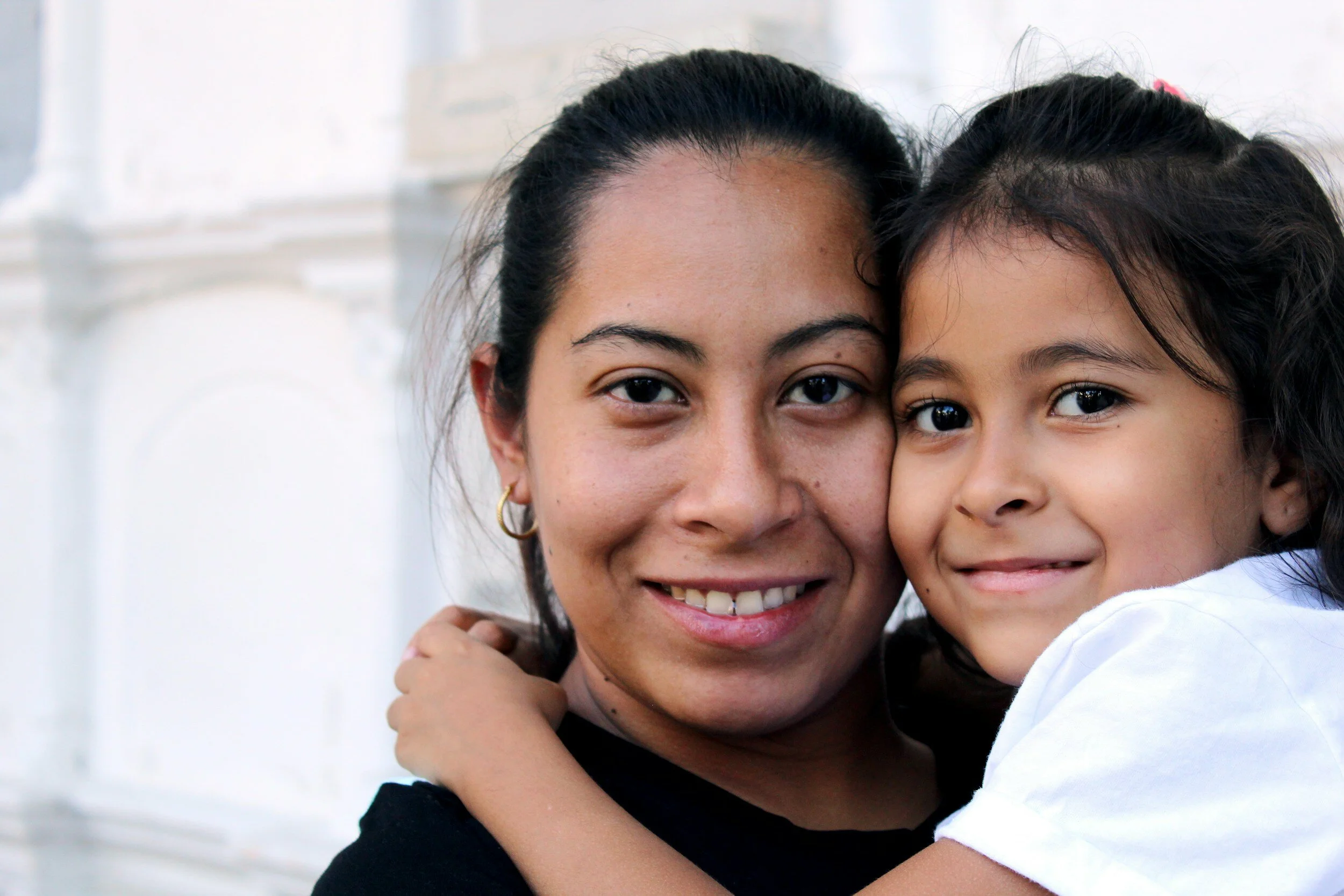
Parents and guardians often face challenges finding the right school for their children. Concerns related to curriculum, communication, and overall educational standards lead to frustration among parents. The need for a comprehensive solution that allows them to search, filter, compare, and save potential schools in one place became evident.
Problem
To address the frustrations of guardians in the school selection process, I aimed to develop a user-friendly mobile application, named "Better School Choice.” The app's primary goal was to empower guardians with the ability to find a suitable school that aligns with their standards.
Goal
My Process


Identify
Define

Ideate

Design
Target Audience
Parents or Guardians with children between the ages of one to seventeen, who are searching for a school that will put their child’s education at the forefront but will also consider the child’s social and mental well-being in their education journey.


User functionality; backed by Research
Methodologies
Empathy maps: Allowed me to empathize with the user by visualizing their thoughts, feelings, and motivations, aiding in designing a user-centered experience.
Competitive Analysis: Helped understand the strengths and weaknesses of the existing school search platforms, enabling me to differentiate Better School Choice.
Interviews: I was able to identify the pain points that parents were experiencing in school search platforms. Parents expressed the desire to find one website that would meet their needs.
Feature Prioritization: Involved in identifying and ranking, through the MoSCow Method, the essential functionalities based on user needs and market trends.
By integrating these research methods, I was able to start creating a user-centric app that would meet the user’s needs.
Users need the ability to have a all-in-one app that allows user an in-depth searching process.
Users need to be able to sort and filter through schools based on preferences.
Users need the ability to be able to witness fist hand the interaction between child and teacher.
Users need the ability to see reviews and recommendations.
User Needs

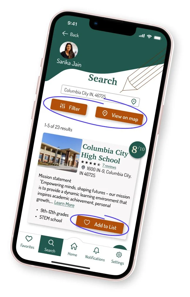
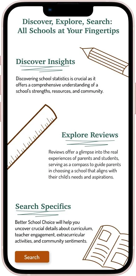
Search and filter - Allow parents to search for schools based on location, curriculum, extracurricular activities, and other relevant criteria.
that resolved the users needs
Essential Features
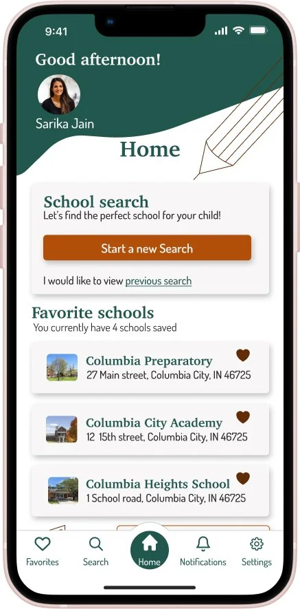
Save and compare - Users can save their preferred schools, and receive a side-by-side comparison feature, allowing guardians to evaluate multiple schools simultaneously and make informed decisions.

Recommended schools - To further assist parents, a feature was implemented where users can answer a short questionnaire about their preferences and priorities. The app then generates a recommended list of schools based on the user's responses, providing personalized suggestions for a more tailored search experience.


Reviews and rankings - Allows users to access valuable insights from other parents and guardians who have experience with the listed schools.
Book a tour - The user will be able to see firsthand how the school interacts with their child. The user can contact the school directly to set up a tour.
The initial design is rarely the optimal solution
Design Process
Sketching- Allowed me to generate and explore a wide range of ideas in a low-fidelity format, enabling me to iterate and consider multiple designs.

Prototyping and user testing- Revealed valuable insights, and feedback, and led to design improvement. Revealed that some of my first concepts needed to be more user-focused.
Clarifying and streamline information
Usability Results
User feedback- Users appreciated the design consistency which allowed the user to feel familiar with the app quickly. Users did indicate that some of the wording was leading to some confusion in navigation. With that feedback, changes were made and retested.
Design iteration- Focus was directed on enhancing the user interface by ensuring that users understand the functionality each button serves. Information overload was addressed by streamlining the user interface and presenting essential details without overwhelming the user. Unnecessary information was removed ensuring that guardians could focus on key factors influencing their decision-making process.

Before usability testing
These form fields confused users with too many options. I reworked the design by eliminating a form field and reworded the context to give clear instructions.

After usability testing
Better School Choice app can address the frustrations of guardians in searching for a school. This app has provided a streamlined search that allows guardians to feel confident in their decisions. The design process doesn’t end at launch: it is an ongoing cycle of iteration and improvement. Regular updates, feature enhancements, and refinements based on user feedback and changing needs are essential to maintaining a successful product.
Conclusion
Take a look at the prototype by click the link below.